UX RESEARCH · UX/UI DESIGN

Modulo

A solo, end-to-end UX/UI concept tackling one of online furniture shopping's biggest challenges — helping people envision furniture in their own home before they buy.

role
Solo Designer
Timeline
6 weeks
tools
Figma
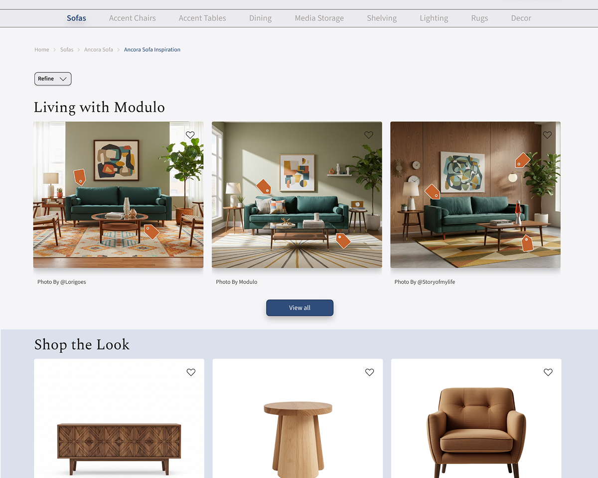
Three living room arrangements featuring green sofas, modern artwork, and wooden furniture. Orange tags indicate shoppable items.
01
Snapshot
Buying furniture online means committing to something you can't fully see in context. Modulo is a sustainable furniture e-commerce brand designed for conscious consumers, built around one core challenge: helping people picture a piece in their actual home before they buy it.

This was a conceptual project completed as part of my UX design program.
4
Users Interviewed
3
Key Findings
3
Platforms Designed
02
Problem
After spending 20 minutes reading reviews, Dana still wasn't sure if the sofa would fit her space or just look like a giant mistake. So, she added it to her cart to "think about it."

This is a massive problem. Buying furniture online feels risky, so people take about a month just to make a final decision.
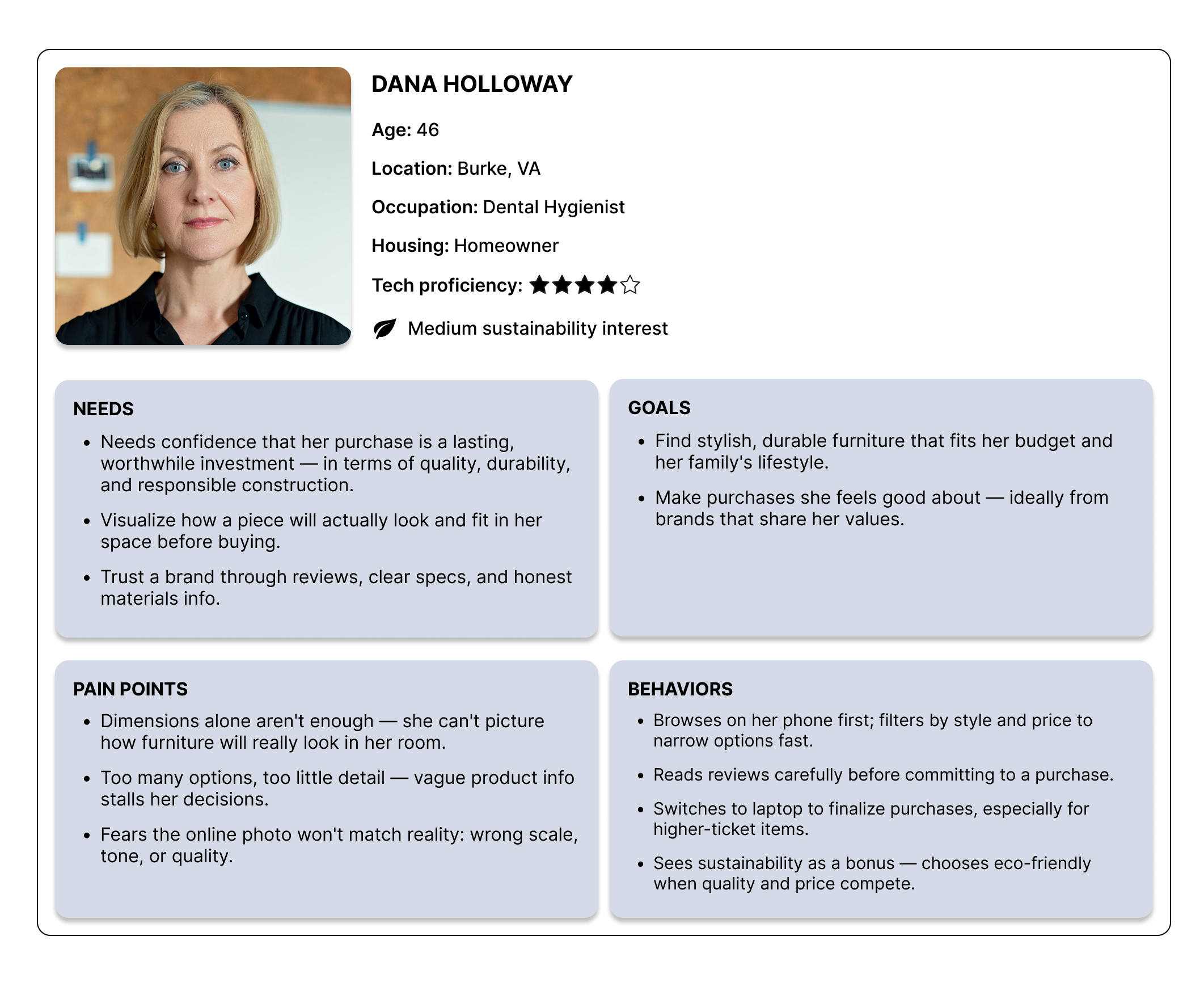
Persona profile for Dana Holloway, a 46-year-old dental hygienist, detailing her needs, goals, pain points, and behaviors related to purchasing furniture.
"I would take masking tape, and I would tape it down on the floor and, like, see what it would be like in the room."

- Ranette, Research participant
The Challenge: How can an e-commerce brand make it easier for people to envision furniture in their own homes so that they can buy with conviction instead of anxiety?
03
Research
I interviewed four online furniture shoppers to understand how they navigate this process. I went in with a few assumptions, but the data quickly set me straight.

Here are the top things I discovered:

The Device Split: 100% of participants browse on their phones but complete the purchase on a desktop. Mobile is for dreaming; desktop is for deciding. Spending that much money just feels safer on a bigger screen.

The Context Gap: Measurements alone aren't cutting it. People are visual. They don't want to see a sofa in a sterile, perfect photo studio; they need to see it in a real room.
"I'm really visual, so when I read the dimensions… it's still hard to visualize. I need to see it right there."

- Jen, Research participant
The Investigation: Users aren't just casually browsing; they are building a case for or against a purchase.

100% of them check reviews first
to look for flaws because they desperately want to avoid an expensive, disappointing mistake.
I'll filter the reviews to the bad ones and check to see if there's a common bad review... if it's like 95% five stars, that makes me a little bit more comfortable to add it to the cart."

— Lindsey, Research participant
User persona for Dana Holloway, age 46, a dental hygienist and homeowner from Burke, VA. The persona outlines her needs (visualizing furniture in her space, building trust through reviews and specs), goals (finding stylish, durable furniture that fits her budget and values), pain points (difficulty picturing scale and material from photos, too many options with too little detail), and behaviors (browsing on mobile first, switching to laptop to finalize purchases, reading reviews carefully before committing
04
Solutions
finding #1
Users need to see furniture in real life, not in a studio.
The Concept: I designed product-specific Inspiration Pages so users could see exactly how a piece looks in a real home, using a mix of customer-submitted photos and Modulo’s own curated styles.
"I like to see how things match -- like how clothes look on models. Same with furniture."

- Derek, Research participant
I also added shoppable product tags to these images so that if someone loves the lamp or coffee table next to that sofa, they can jump straight to it to help them imagine the full picture.

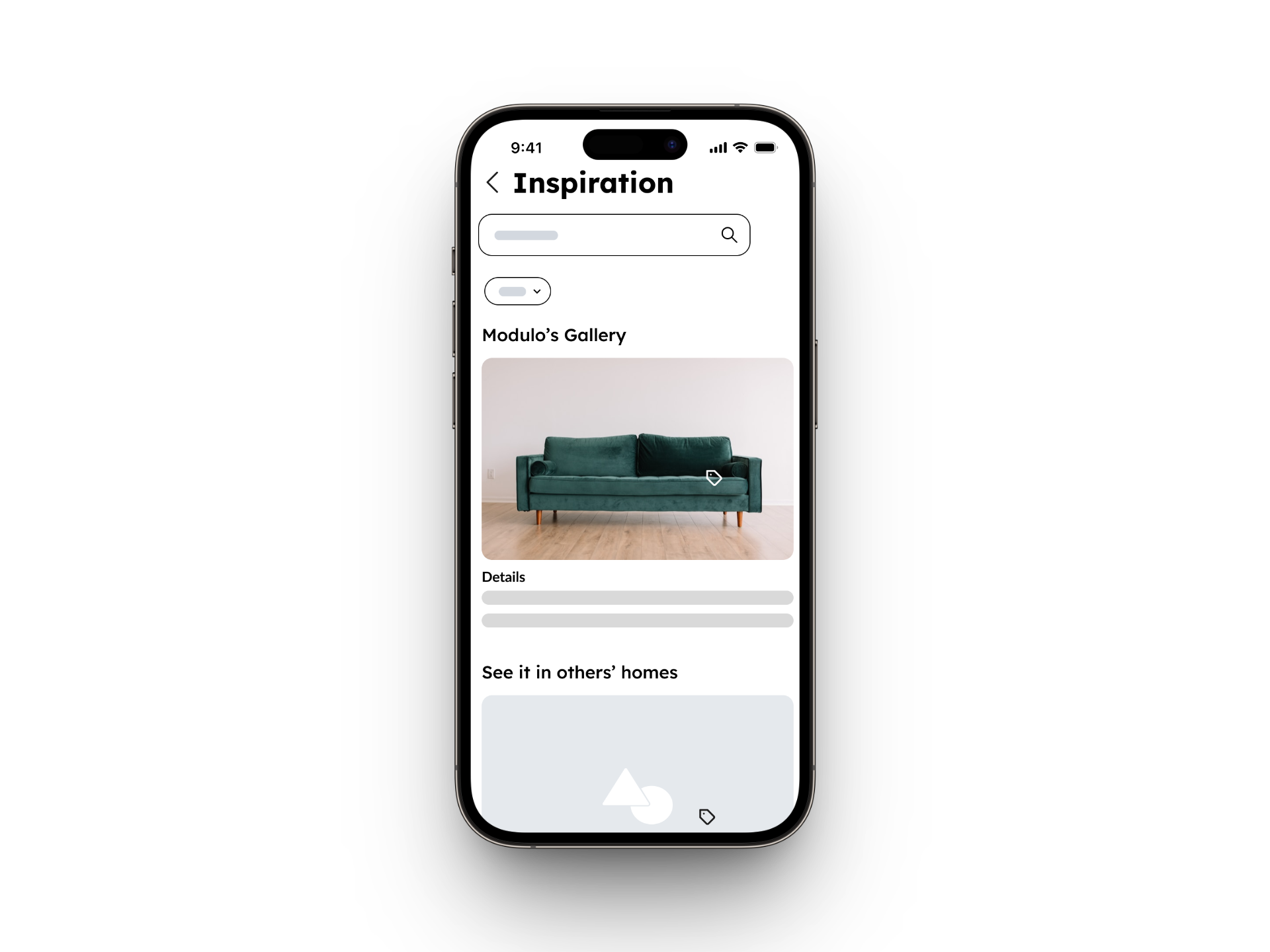
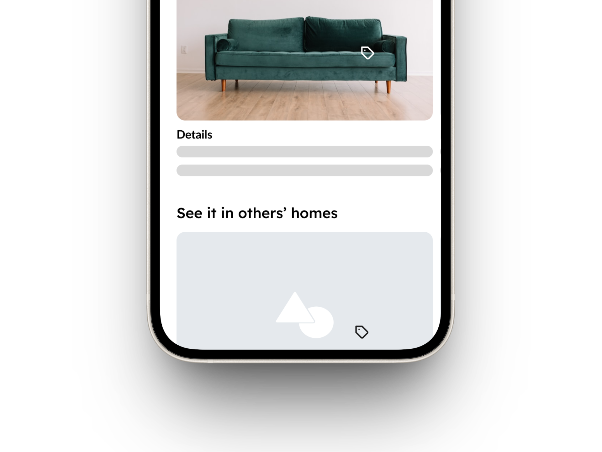
The Lo-Fi Flop:
During testing, the entire Inspiration Page completely fell flat. After a brief moment of humility, I moved on to the data.

My mistake was that the wireframes were too low-fidelity. Without real-ish photos, users couldn't grasp the concept. Lesson learned: sometimes a low-fi needs to be a mid-fi so users actually get the point.

Mystery #1: The Content Titles: In the lo-fi, the title read, "See it in others' homes."

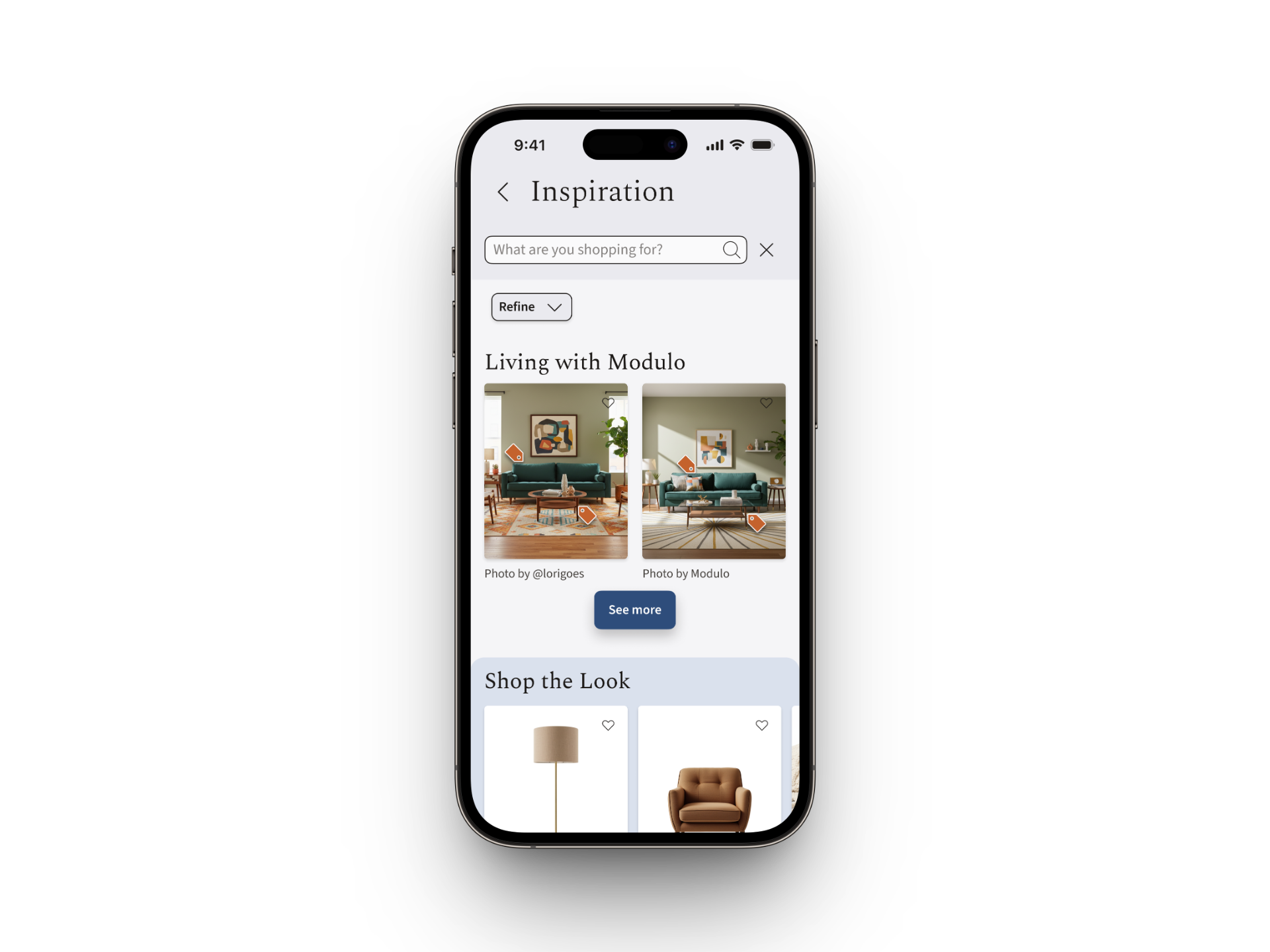
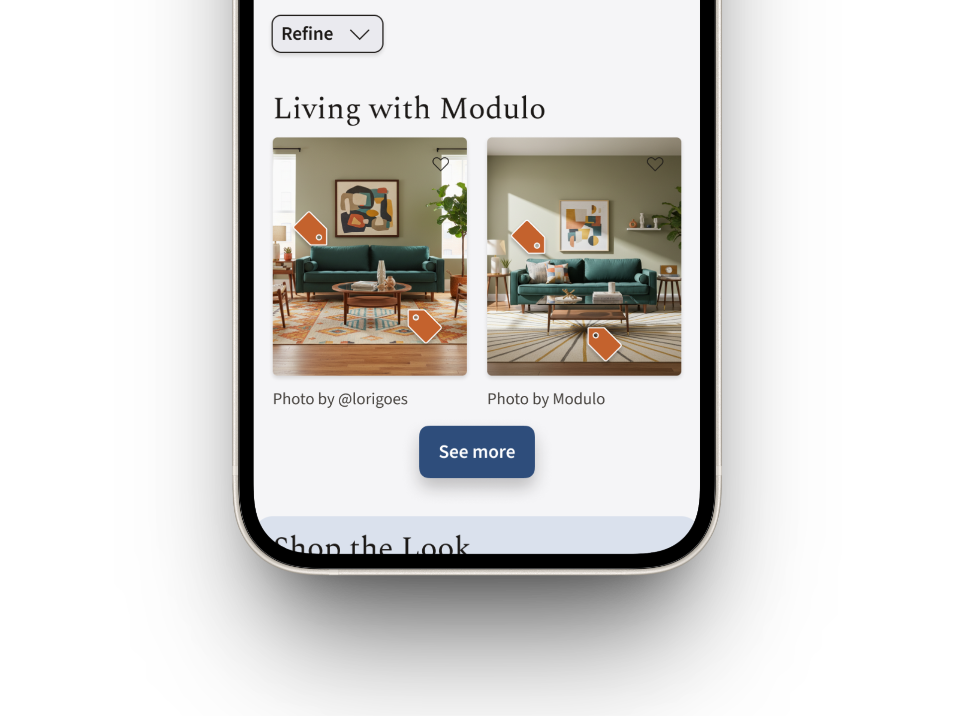
For the hi-fi, I shortened it to "Living with Modulo" to keep it clean, short, and sweet. But honestly? I’m not convinced it's clear enough.

My next step is to test whether "Living with Modulo" is too vague and if a literal title works better.

Mystery #2: The Untouched Tags: Absolutely nobody interacted with the product tags in the lo-fi testing. After comparing my screens to competitors, I realized mine were too small and lacked contrast.

For the hi-fi, I made them larger, switched them to brand orange, and placed them over solid background areas.

Accessibility matters to me, so my next step is formally checking these against WCAG contrast ratios and testing if users interact with them now.

A smartphone displaying an inspiration page with a green sofa in Modulo's Gallery.
Lo-Fi: tags were missed, purpose unclear
A smartphone screen displaying an inspiration page with a search bar, refine button, and two images of a living room with the text "Living with Modulo" and "Shop the Look" below.
Hi-Fi: orange tags, white border, drop shadow effect, new titles
finding #2
Give them the details upfront.
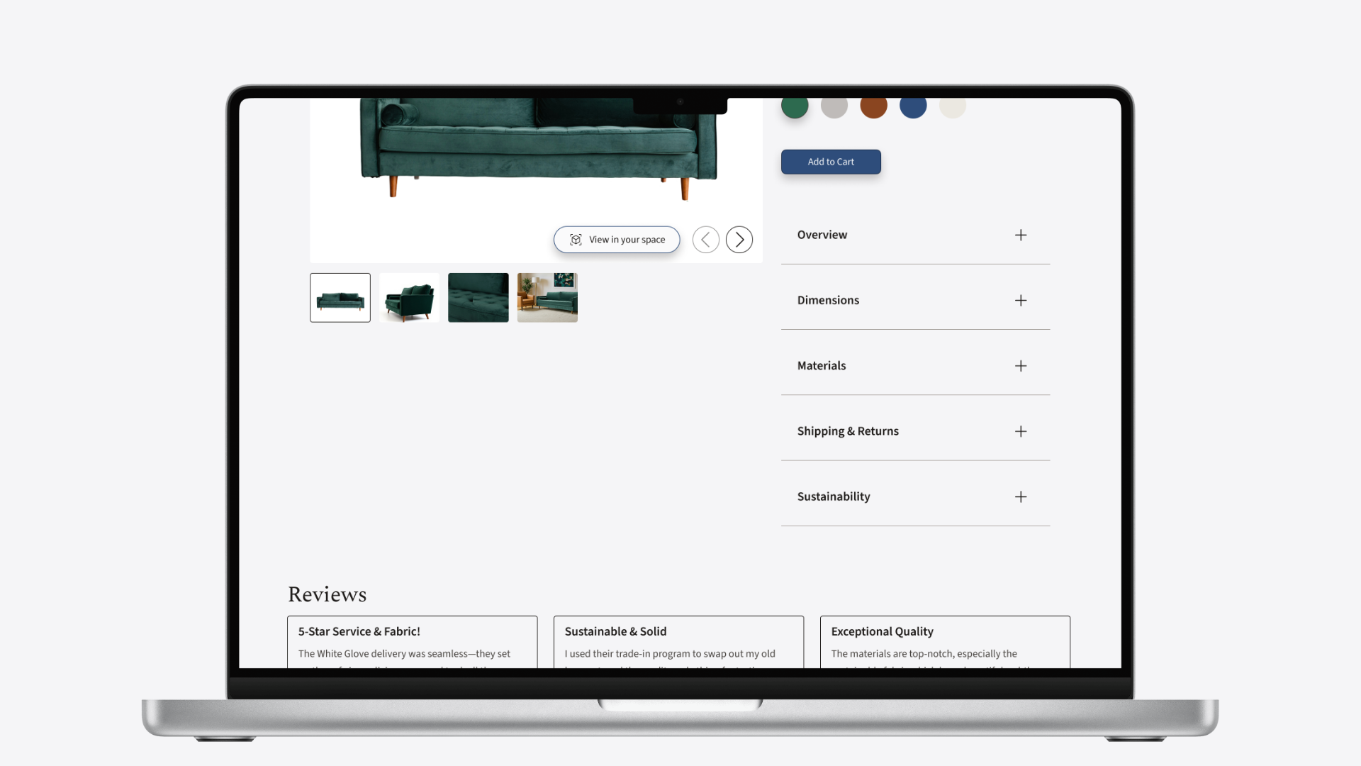
The Fix: Since reviews are one of the first things people hunt for, I moved them much higher on the Product Detail Page (PDP) for easier access.

The Layout: I consolidated price, materials, shipping, and returns into a single, clean accordion structure. Short, sweet, and right where you expect it. No endless scrolling required.

The Validation: While no one specifically commented on the review placement during testing, they found all the information they were looking for. One user even ran through her mental checklist out loud, and it was all right there.
finding #3
Streamline their path.
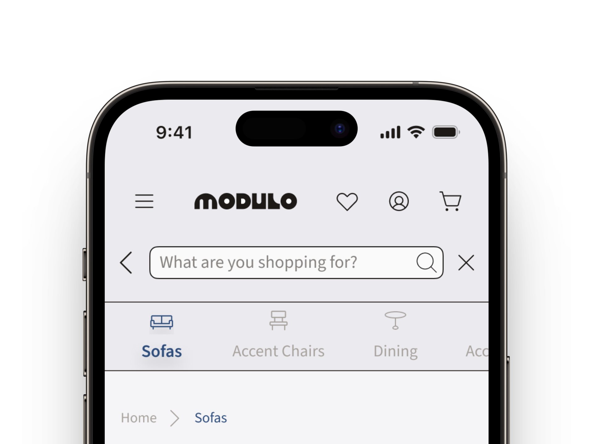
The Fix: I streamlined the layout by making two core changes: I reorganized the navigation directly by "Furniture Type" instead of "Room Type" to eliminate extra clicks, and I stripped the homepage down to just three essential sections to reduce choice fatigue.

The Result: The navbar gives users exactly what they came for - if it was a sofa, let’s get them straight to the sofas. The scaled-down homepage completely prevents click fatigue. In lo-fi testing, 100% of participants rated the ease of navigation a 5 out of 5.
"Everything was clearly laid out and set up in a way I expected when shopping online.""Everything was clearly laid out and set up in a way I expected when shopping online."

- Ranette, Research participant
A smartphone screen displaying the Modulo shopping app with a search bar, navigation icons, and category options including 'Sofas'.
Hi-Fi Mobile: Navigation organized by furniture type.
05
The Final Showcase
Inspiration Page
Real rooms and real spaces, styled by both customers and Modulo’s curators, complete with product tags to help users visualize the full, cohesive picture. 
A phone screen displaying details about a green velvet sofa and a section titled "See it in others' homes" with abstract shapes.
Lo-Fi Mobile: Before
Mobile phone screen showing "Living with Modulo" with 2 images of a living room featuring a teal sofa. Both images have orange tag icons overlayed and are captioned "Photo by @lorigoes" and "Photo by Modulo". Below the image is a "See more" button.
Hi-Fi Mobile: After
Mobile Prototype
Click to explore.
Product Details Page
Accordions keep the details organized, and reviews are front and center.
Laptop displaying a product page for a green velvet sofa, showing product images, color options, an "Add to Cart" button, product details, and customer reviews.
Hi-Fi Desktop
Desktop Prototype
Click to explore.
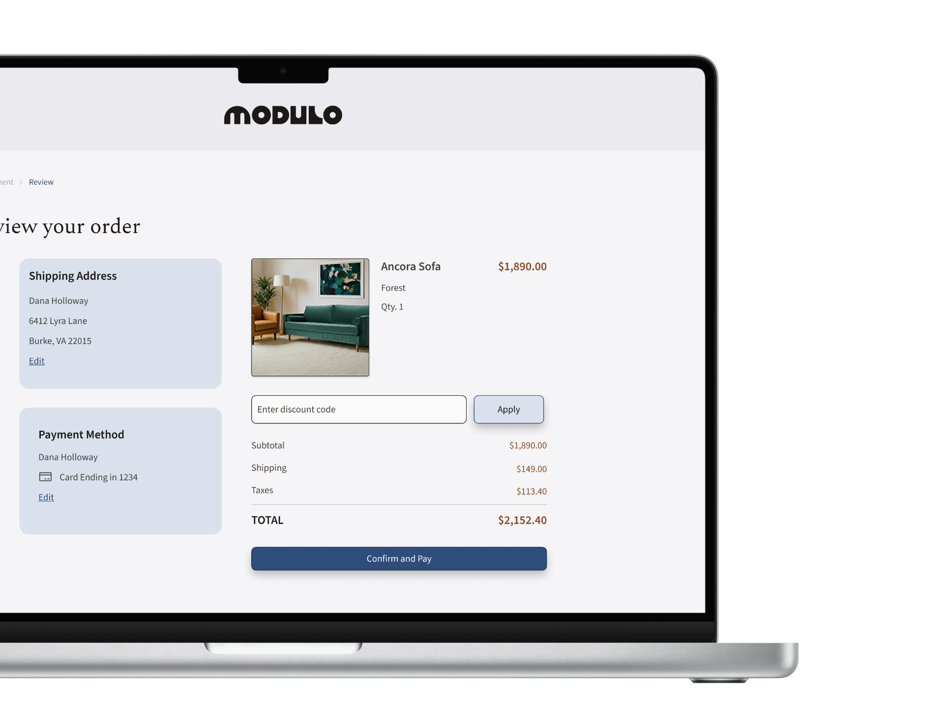
Dana's Journey
Complete. After a month of lunch-break scrolling and seventeen open tabs, she's on her laptop, she can see exactly how it fits, and she feels ready to hit checkout.
Laptop screen displaying an order review page for a Modulo "Ancora Sofa". The page shows shipping address, payment method, an image of the sofa, and a cost breakdown including subtotal, shipping, taxes, and total cost, with a Confirm and Pay button.
06
Reflection
What I’m most curious about: Testing the Inspiration Page. Lo-fi testing told me the concept resonated once users understood it. The hi-fi refinements were designed to make it immediately discoverable without explanation, but I haven't tested that yet.

Next, I want usability testing to answer two questions:

1. Do the larger tags, orange accents, and clearer titles do the job on their own?

2. Does the page actually keep users on Modulo instead of drifting off to Google?

Accessibility Check: While I adjusted the visual contrast and size of the product tags in hi-fi, my next step is to run a formal WCAG contrast check and test them with users to ensure they are immediately noticed.

What surprised me the most: Some users engaged with the AR features, but they ultimately preferred real photos.

For the next iteration, I want to explore 3D room rendering, the kind where you place furniture into a virtual version of your own space to see how it fits, much like IKEA’s website.
Takeaway 1:
The hardest part of buying furniture online is simply picturing it in your home. Even with measurements and AR tools, users still struggle to visualize the final look.
What I’m still thinking about: My research showed that 100% of participants browsed on mobile but bought on desktop. I didn't know how to leverage this data during the design phase, but I have ideas for Phase 2.

While I am fully committed to absolute device consistency so users never feel disoriented, I want to optimize the UI for how each device is physically handled:

On Mobile: Focus on maximum visual real estate. Make images crisp and prominent so users can imagine the piece in their space, and place all interactive elements in easy-to-tap target zones.

On Desktop: Streamline the checkout layout for absolute clarity.

The ultimate goal?

Make mobile browsing so immersive and mobile checkout so seamless that users feel confident enough to hit "buy" right from their phones.
Takeaway 2:
Mobile is for dreaming; desktop is for deciding.
Cross-device behavior requires distinct optimization strategies, not just responsive scaling.
What I learned: This project taught me how much I enjoy the duality of the analytical logic of UX data, and the expressive craft of UI composition.

Knowing when to follow the metrics and when to trust the visual flow is a skill I'm really excited to keep building.
Takeaway 3:
Good design has a duality I genuinely love where the artistic side brings the joy,
but the analytics keep me engaged.
Next Case Study
Ember