accessibility · UX/UI DESIGN

Ember

A WCAG-compliant beginner-friendly meditation app for people who think they can't meditate.

role
Solo Designer
Timeline
2 weeks
tools
Figma, Lottie Files
Mobile phone screen displaying a lesson on "Yes Meditation" with multiple-choice options and a "Next" button.
01
Snapshot
Most popular meditation apps focus on content delivery, assuming users already know the basics. Ember teaches the skill first.

Inspired by micro-learning platforms like Duolingo and rooted in accessible, trauma-informed design, Ember meets beginners exactly where they are, regardless of their body, their breath, or how busy their brain is.
2
Creative Directions Explored
1
Technique Prototyped
2
Animation Systems Built
02
Problem
With my background as a yoga teacher, I hear one thing constantly:

"I can't meditate — my mind won't quiet."


It's the same misunderstanding I hear about yoga, that you need to be flexible to practice. You don't. And you don't need a quiet mind to meditate, either. You also don't need to sit cross-legged on the floor, follow a specific breathing pattern, or practice any single "right" way. Meditation is inherently accessible, but many digital experiences unintentionally overlook the onboarding process needed to show that.

Traditional platforms often function as vast libraries of guided audio, which can inadvertently skip over foundational mechanics: how to adapt postures, how to navigate breathing discomfort, or how to handle a wandering mind.

For a beginner, jumping straight into a session without this context can lead to frustration, making them feel like they are "doing it wrong" and causing them to abandon the practice entirely.

Problem statement: Beginner meditators need a way to learn that meditation is accessible to them — in their body, at their pace — because without that foundation, they often mistake normal mental distractions for personal failure and quit the practice.
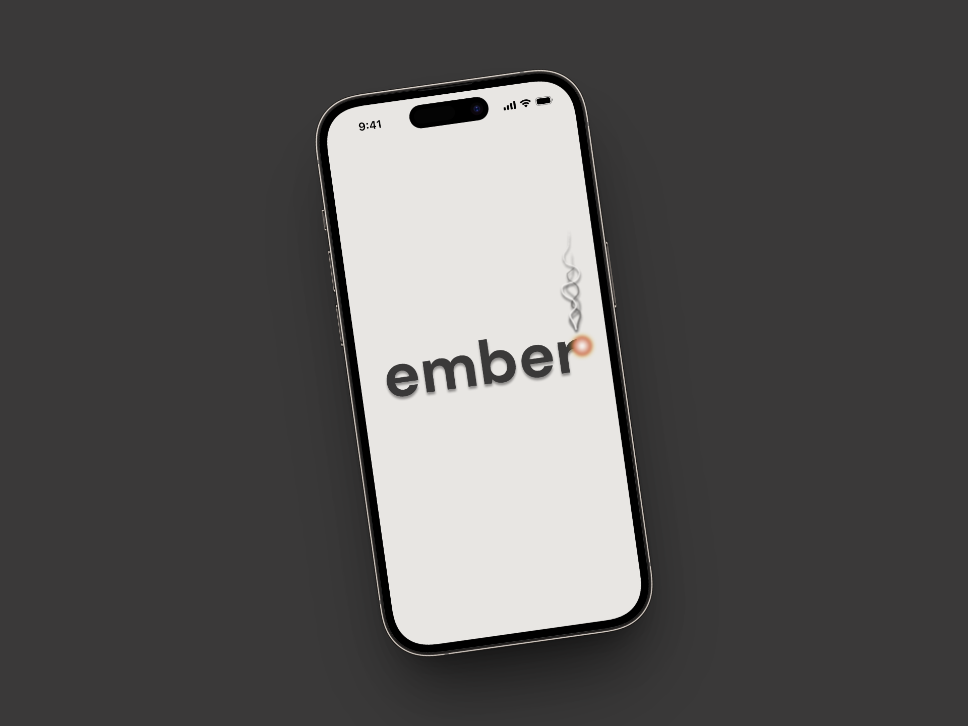
A smartphone displaying the word "ember" with a small stylized flame icon next to it.
"I can't meditate - my mind won't quiet."

- My students, everywhere
With my background as a yoga teacher, I hear one thing constantly:

"I can't meditate — my mind won't quiet."


It's the same misunderstanding I hear about yoga, that you need to be flexible to practice. You don't. And you don't need a quiet mind to meditate, either. You also don't need to sit cross-legged on the floor, follow a specific breathing pattern, or practice any single "right" way. Meditation is inherently accessible, but many digital experiences unintentionally overlook the onboarding process needed to show that.

Traditional platforms often function as vast libraries of guided audio, which can inadvertently skip over foundational mechanics: how to adapt postures, how to navigate breathing discomfort, or how to handle a wandering mind.

For a beginner, jumping straight into a session without this context can lead to frustration, making them feel like they are "doing it wrong" and causing them to abandon the practice entirely.

Problem statement: Beginner meditators need a way to learn that meditation is accessible to them — in their body, at their pace — because without that foundation, they often mistake normal mental distractions for personal failure and quit the practice.
03
Process
Research & Discovery

This was an open-ended student project with a focus on animation and microinteractions, which gave me the freedom to design something I genuinely cared about.

I started with competitive research across the major meditation apps. The finding was consistent and clear: while these apps excel at providing ongoing content libraries, they rarely focus on step-by-step pedagogy for the physical and mental fundamentals of practice.
Key insight
People don't need more audio sessions.
They need to understand how to practice in a way that aligns with their body and lifestyle before the session even starts.
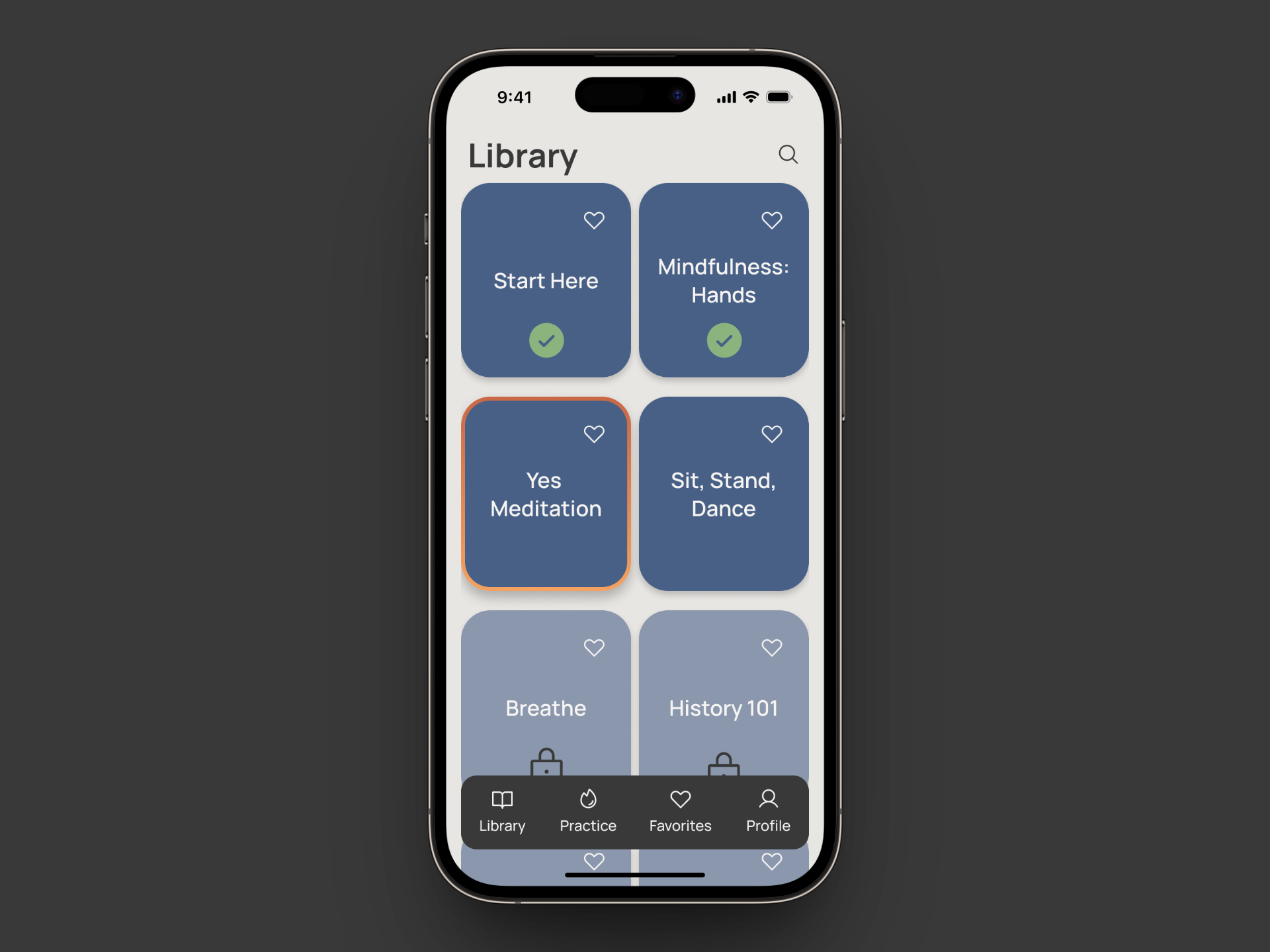
A smartphone screen displays a meditation app's library with different meditation categories like 'Start Here', 'Mindful Sleep', 'New Meditation', and 'Sit, Stand, Dance'.
Library Screen
Two creative directions for a meditation app called Ember. Direction 1 uses light and approachable colors and fonts. Direction 2 uses warm and grounded colors and fonts. Both directions show app screens for library, lesson, and practice.
Creative Directions
Defining the experience
From my research, I developed two moodboards and explored two creative directions before moving into wireframes.

My instructor noted they weren't dramatically different from each other, which is honestly fair. But the exercise clarified my visual thinking and gave me a foundation to build from.
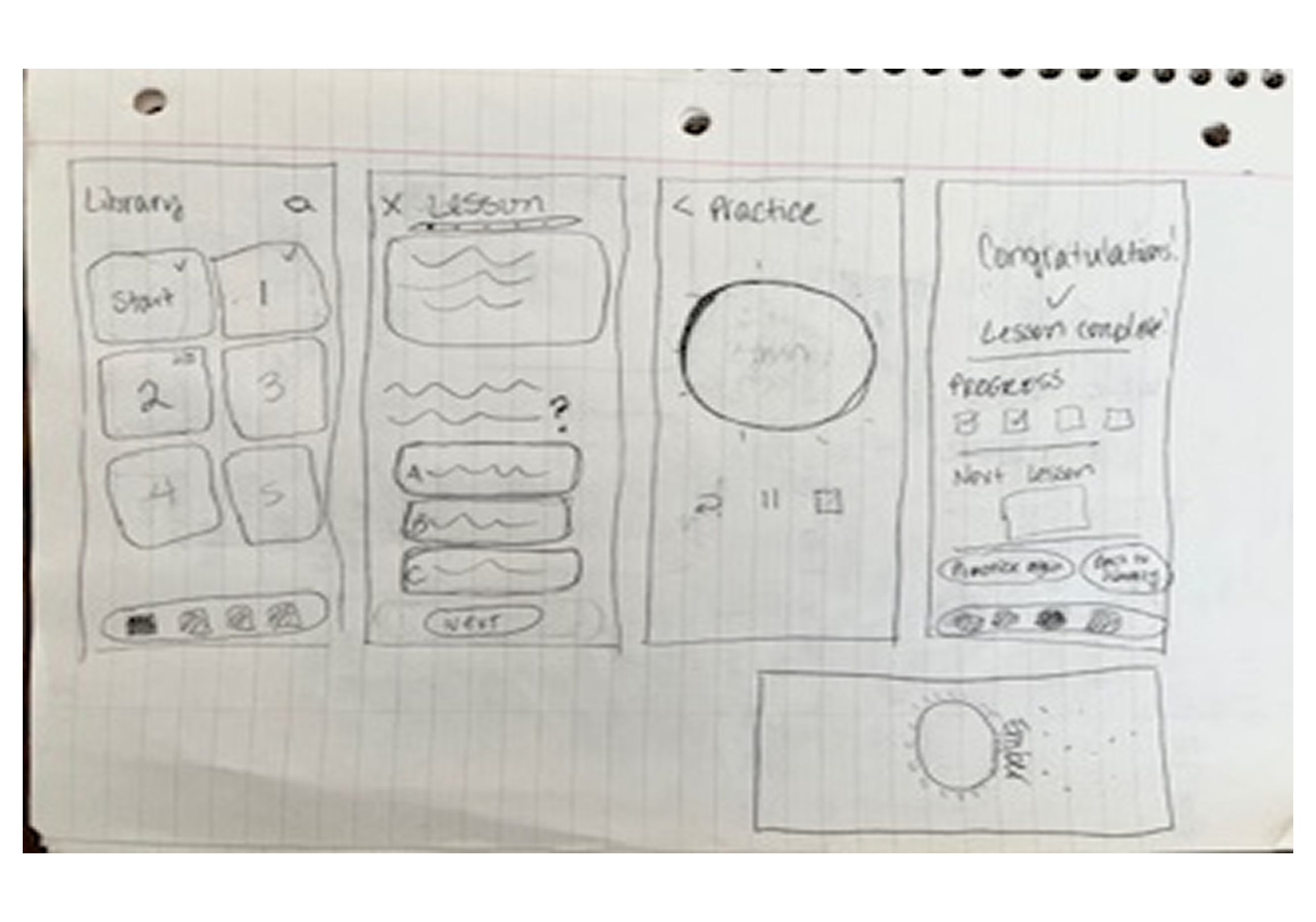
Next, I sketched lo-fi wireframes by hand, intentionally keeping them rough to avoid jumping to visual decisions before the structure is ready.

From there, I built out a full component library in Figma: text styles, color styles, and reusable components to carry the visual system through every screen.
Wireframe sketches for a mobile application showing a library with numbered lessons, a lesson screen with multiple choice questions, a practice screen, and a congratulations screen indicating lesson completion.
Lo-Fi Sketch
Lesson Structure
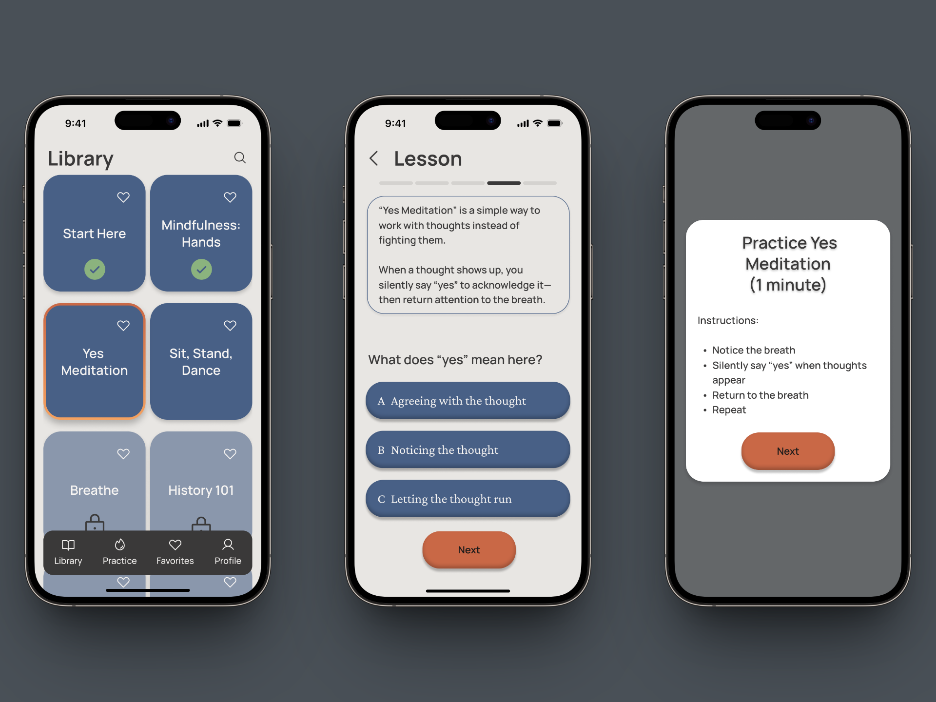
Each course contains roughly five short lessons with embedded questions, both clarifying and quiz-style, culminating in a 60-second guided practice.

Each lesson is intentionally short, consistent with Miller's Law, which tells us users can only process small chunks of information at a time.

The structure is purposeful: users arrive at the practice already prepared. They know how to position their body, how to work with their breath, and what it means when their mind wanders.

The celebratory screen that follows includes a trauma-informed message, something like "It's normal to have a racing mind — noticing that IS the practice."

Meditation has deep cultural and historical roots, and the experience needed to reflect that respect at every touchpoint, including the moments after a session ends.
Three phone screens displaying a meditation app interface. The first shows a library of meditation options, the second features a "Yes Meditation" lesson with multiple-choice questions, and the third provides instructions for a 1-minute practice.
Hide or add 3 screens in one image; start to finish of something
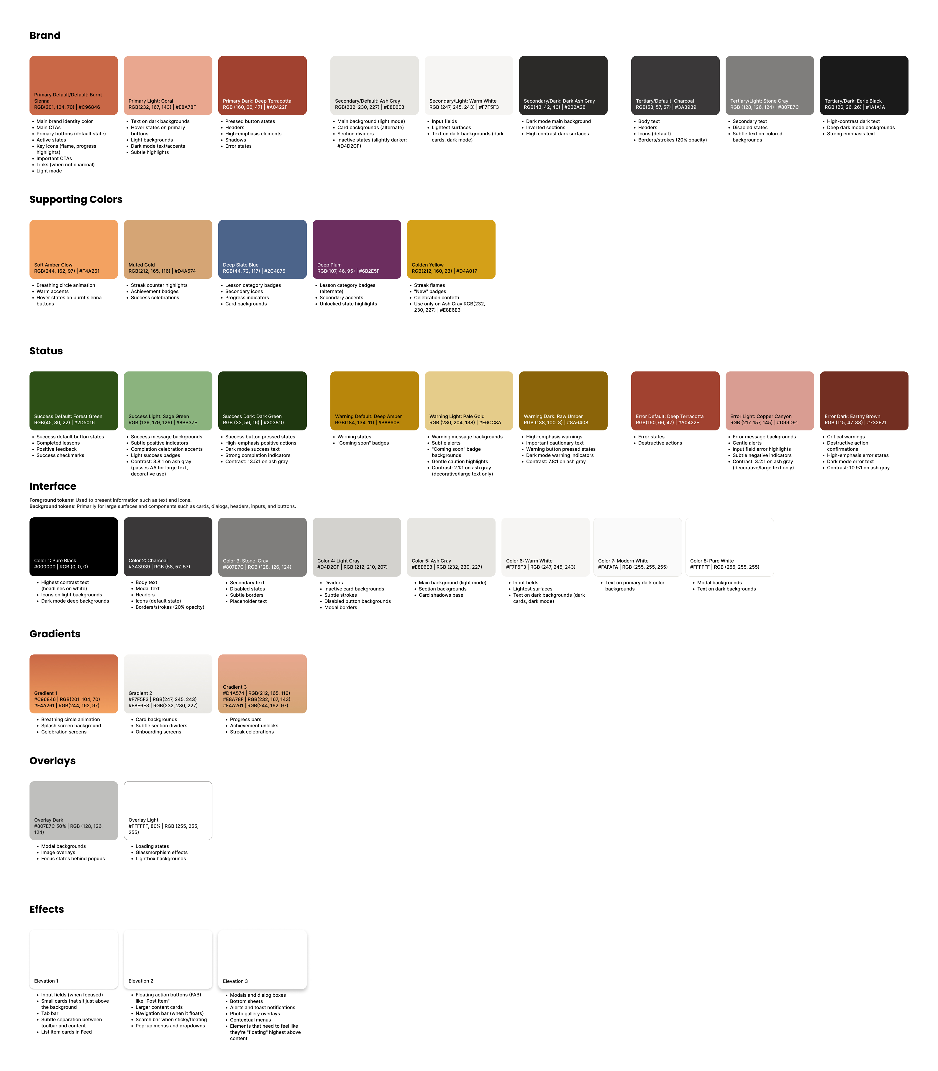
A detailed UI design style guide showing color swatches, gradients, overlays, and effects with usage instructions.
Design system: UI Color Styles Style Guide, outlining brand, supporting, status, and interface color palettes alongside gradients, overlays, and elevation effects.
The visual system
The name Ember draws from early meditation practices that used fire and candle gazing as focal points. An ember is a quieter, sustained form of attention; something tended over time, not ignited all at once.

The visual system reflects that: warm ambers, ash tones, soft neutrals. Every color meets WCAG accessibility standards.

The meditation timer is a small ember dot that grows slowly into a full circle — calm and grounding, not a countdown.
the animation challenge
This is where the project got genuinely interesting and occasionally humbling. The bootcamp brief was focused on animation and microinteractions, so I pushed into territory I hadn't fully explored.

The screen I'm most proud of is the splash screen. It required building across multiple screens and layered animations to pull off, and figuring it out was genuinely fun. My one wish is that the smoke feels closer to real smoke and less like the animation that it is, but it is something to keep refining.

For the sparkle animation, I worked extensively with Lottie Files. The Figma plugin had reliability issues that pushed me to work directly through the Lottie Files website. It was a pivot that cost time but gave me a more stable workflow and a deeper understanding of how the tool behaves under pressure.

From there, I studied how celebratory moments work in apps like Duolingo and ran into a real design dilemma. Duolingo's celebrations are designed to feel like winning. Meditation is designed to feel like releasing the need to win. Those things are in direct conflict.

Ultimately, I wrestled with how to motivate users without making meditation feel performative or culturally disrespectful. I made the deliberate choice to scale back the gamification (which, by the way, was a practice in meditation itself).

Behavioral psychology tells us that small moments of positive reinforcement can keep users engaged and coming back. The goal wasn't to eliminate that motivation, but to calibrate it. Enough to encourage the next lesson. Not so much that it undermines the practice itself.  

What I landed on: a small sparkle animation, like sparks flying from an ember when you blow on it.

Subtle. Meaningful.

A quiet nod to stoking your practice rather than a loud reward for completing a task.

A smartphone displaying the word "ember" with a small stylized flame icon next to it.
Splash Screen
04
Solution
This prototype centers on Yes Meditation, a technique rooted in accessible yoga and taught by my teacher, Jivana Heyman. It's one of several practices Ember will eventually teach, each chosen to show users that there is no single right way to meditate.

Some people sit. Some stand. Some walk. Others work with breath or grounding techniques.

Ember's lesson structure is designed to help users explore until they find what creates ease for them.
Splash Screen
The splash screen is where Ember announces its personality before a single lesson loads. The word "ember" appears in lowercase, with a glowing ember at the tip of the r and smoke rising from it — two animations playing together, the ember glowing and the smoke drifting upward. It's the first moment of calm the app offers, and it sets the tone for everything that follows.
A smartphone displaying the word "ember" with a small stylized flame icon next to it.
Splash Screen
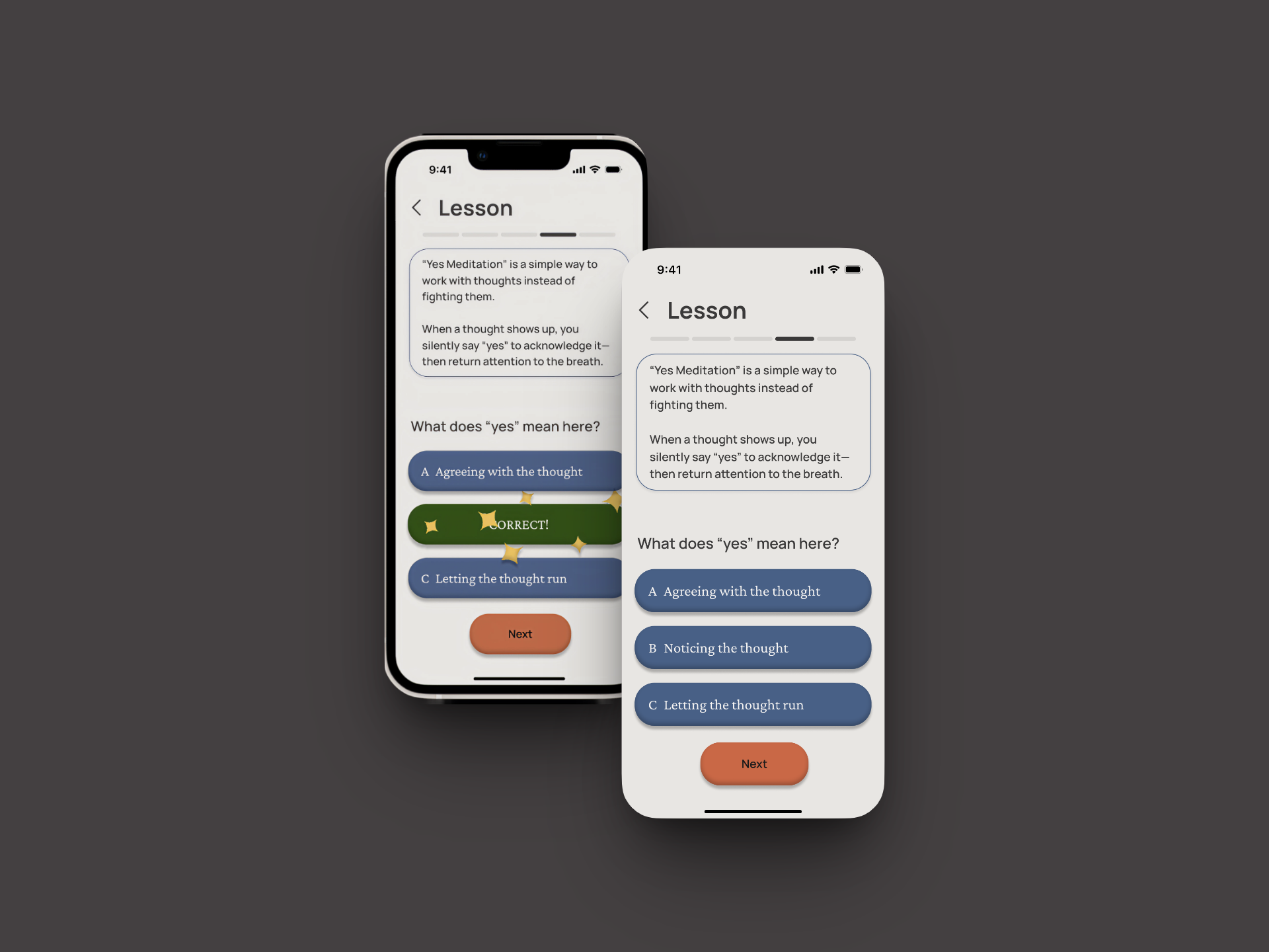
Two iPhones displaying a lesson on "Yes Meditation" with a multiple-choice question and a correct answer highlighted.
Lesson Screen
Lesson Screen
Short, structured, and scaffolded so users feel prepared before they ever close their eyes
Timer Screen
A single ember dot that grows slowly from small to large, like an ember being stoked. Calm, one-directional, and something gentle to focus on without instruction.
Two phone screens showing a meditation app interface. The left screen displays a central orange dot and playback controls. The right screen reads, "You did it! How did that minute feel?” with a larger orange gradient circle and three buttons: "Easy", "Quiet", and "Neutral".
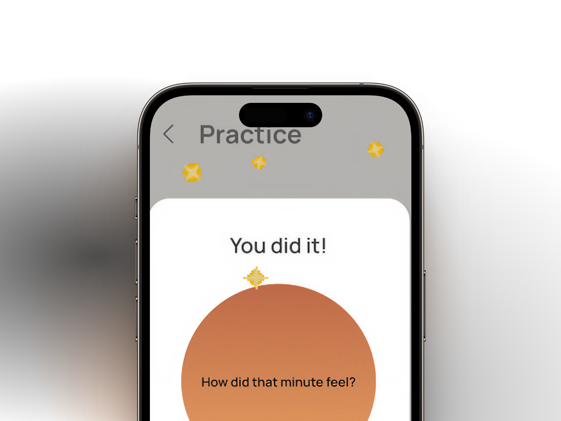
A mobile phone screen displaying "Practice" at the top, with a message "You did it!" with sparkles surrounding it and a prompt "How did that minute feel?" centered on a gradient circle.
Celebratory Screen
After practice, a subtle sparkle Lottie animation plays, and a trauma-informed message appears. No score. No streak pressure. Just a message that reframes the experience rather than just rewarding completion.
05
Reflection
I love this app. I hope to build it out fully someday and share it with my yoga teacher community, and with the people who keep telling me they can't meditate.

This project taught me that good design sometimes means choosing what not to do. Scaling back the gamification wasn't a compromise. It was a design decision, made with intention, grounded in respect for the practice and the people it's meant to serve.

Feedback received:
‍•
The home page needed more breathing room
‍• Cards would feel more dynamic with images rather than flat color
‍• The timer screen received strong positive feedback for its calm, focused feel

What's next for Ember:
Add breathing room to the home page
‍• Replace flat card colors with images
‍• Refine the splash screen smoke and Lottie animations
‍• Build out additional lesson content, courses, and meditation styles
‍• Conduct user research and usability testing on the hi-fi prototype
‍• Explore trademark clearance (other companies share the name Ember — something to address before any commercial path forward)

Ember was created as part of a project in my UX/UI Design program, an open brief with a focus on animation and microinteractions. It has since become a passion project.
Next Case Study
Givenly