UX RESEARCH · UX/UI DESIGN

Givenly

* In progress*

A hyperlocal iOS marketplace connecting neighbors to buy, sell, and gift items within their own communities.

role
Solo Designer
Timeline
2 weeks
tools
Figma, FigJam, Apple Human Interface Guidelines (HIG)
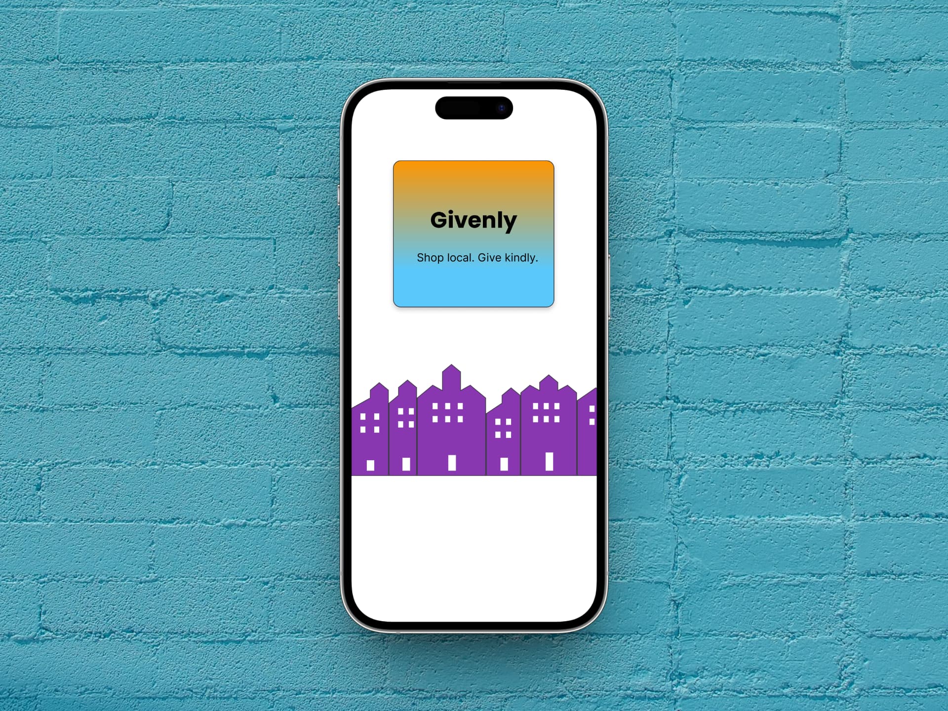
A smartphone displaying the Givenly app logo, which features a gradient from orange to blue with the text 'Givenly' and 'Shop now. Care locally.' below it. A purple silhouette of buildings is displayed at the bottom of the phone screen.
01
Snapshot
Givenly is a mobile marketplace app for iOS designed around the spirit of generosity and community connection — directly inspired by BuyNothing groups, where neighbors give and receive to strengthen local bonds. Unlike purely transactional marketplaces, Givenly treats commerce as an act of community care.

Users can browse and post items, connect through in-app messaging, and coordinate payments and meetups directly — keeping the experience personal, flexible, and neighborly. The name came from combining the root word "give" with the warm suffix "-ly" (as in "friendly" or "neighborly"). An earlier contender was "Kindlist" — until my husband pointed out it sounded a little too close to "Kindless." User research takes many forms.

This was a conceptual project completed as part of my UX design program.
2
Apps Analyzed
5
Screens Designed
1
Mini Design System Built
02
Problem
Most of us have been there: you have something in your house you don't need anymore, and you'd rather it go to a neighbor than a landfill. But selling online can feel transactional and impersonal, and the platforms built for it weren't designed with community in mind.

Facebook Marketplace works, but it's a lot. OfferUp is cleaner, but it still feels like a store. Neither one feels like a neighborhood.

Givenly started from a simple question: what would a marketplace look like if it were built around generosity first? How can a local marketplace feel less like a transaction and more like a favor between neighbors?
A smartphone displaying the Givenly app logo, which features a gradient from orange to blue with the text 'Givenly' and 'Shop now. Care locally.' below it. A purple silhouette of buildings is displayed at the bottom of the phone screen.
Most of us have been there: you have something in your house you don't need anymore, and you'd rather it go to a neighbor than a landfill. But selling online can feel transactional and impersonal, and the platforms built for it weren't designed with community in mind.

Facebook Marketplace works, but it's a lot. OfferUp is cleaner, but it still feels like a store. Neither one feels like a neighborhood.

Givenly started from a simple question: what would a marketplace look like if it were built around generosity first? How can a local marketplace feel less like a transaction and more like a favor between neighbors?
03
Process
I came into this project with a lot of reading to do. Apple's Human Interface Guidelines (HIG) aren't short, but I actually read most of them. I loved having this framework for helping me make decisions, so that the design felt grounded rather than guessed.

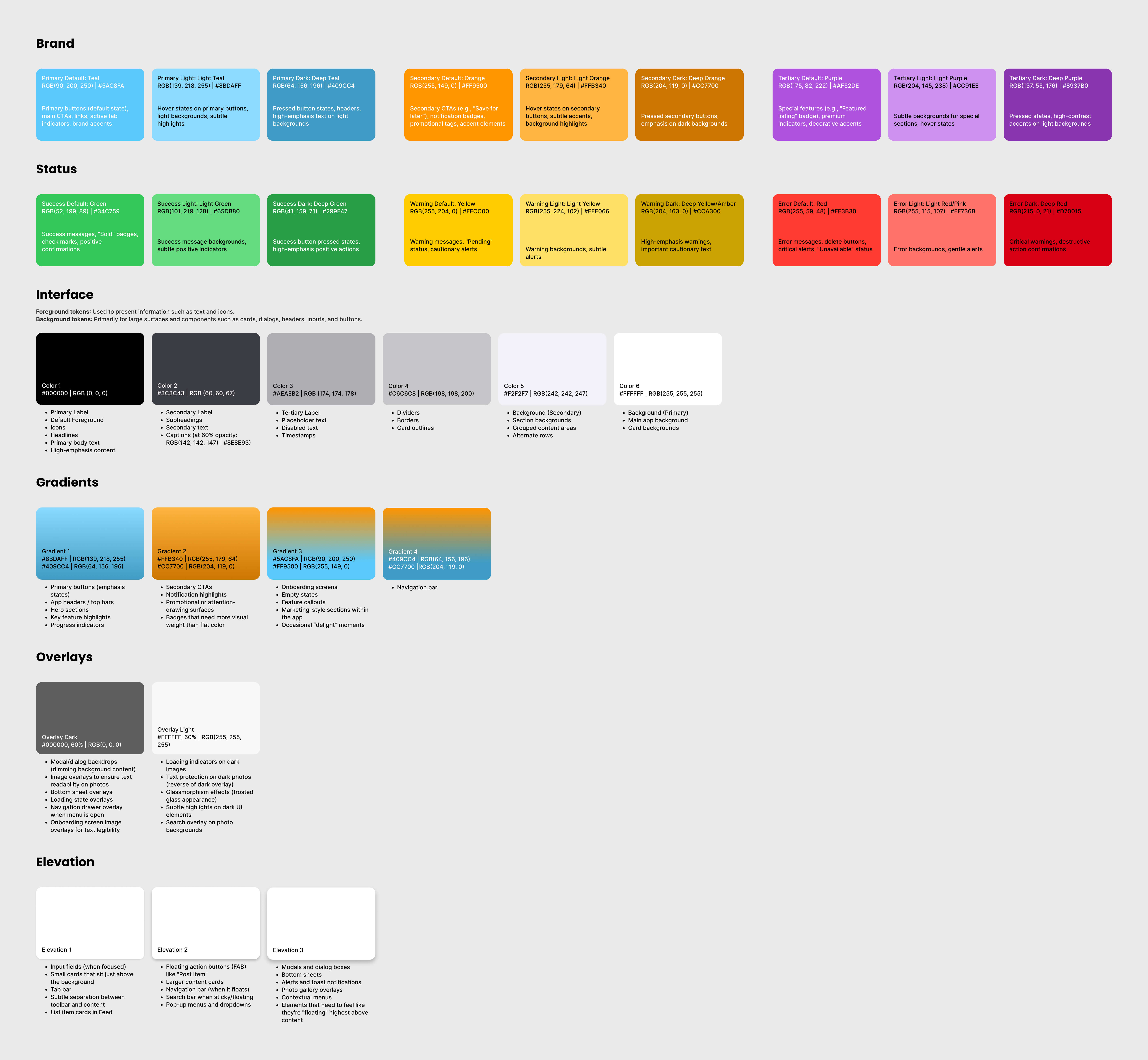
For example, I pulled the color palette directly from Apple's system colors (Teal, Orange, Purple) because they're pre-optimized for accessibility across devices. I verified every text-on-background combination against WCAG AA contrast ratios, including text on teal, which took a few rounds to get right.

The name took its own journey. An early contender was "Kindlist" — until my husband pointed out it sounded a little too close to "Kindless." He wasn't wrong.

Givenly came from wanting something that felt warm and approachable without being precious. The "-ly" suffix does a lot of work: friendly, neighborly, givenly. It signals the tone before anyone reads a single feature description.

I sketched five lo-fi wireframe screens before building the hi-fi version in Figma. The hi-fi build is where things got technical fast. Auto layout in Figma, and I had a complicated relationship on this project.

I clicked every button trying to get a vector to center-align inside a frame. The jumping button issue, where a button would visually shift between its default and pressed states, turned out to be an alignment mismatch between the two. Fixing it felt like a genuine victory.

The cover screen wasn't required by the project brief, but I built it anyway as an opportunity to test Figma Make and give the app a proper brand entrance.
User persona for Dana Holloway, age 46, a dental hygienist and homeowner from Burke, VA. The persona outlines her needs (visualizing furniture in her space, building trust through reviews and specs), goals (finding stylish, durable furniture that fits her budget and values), pain points (difficulty picturing scale and material from photos, too many options with too little detail), and behaviors (browsing on mobile first, switching to laptop to finalize purchases, reading reviews carefully before committing
finding #1
Platform conventions build trust before a user reads a single word.
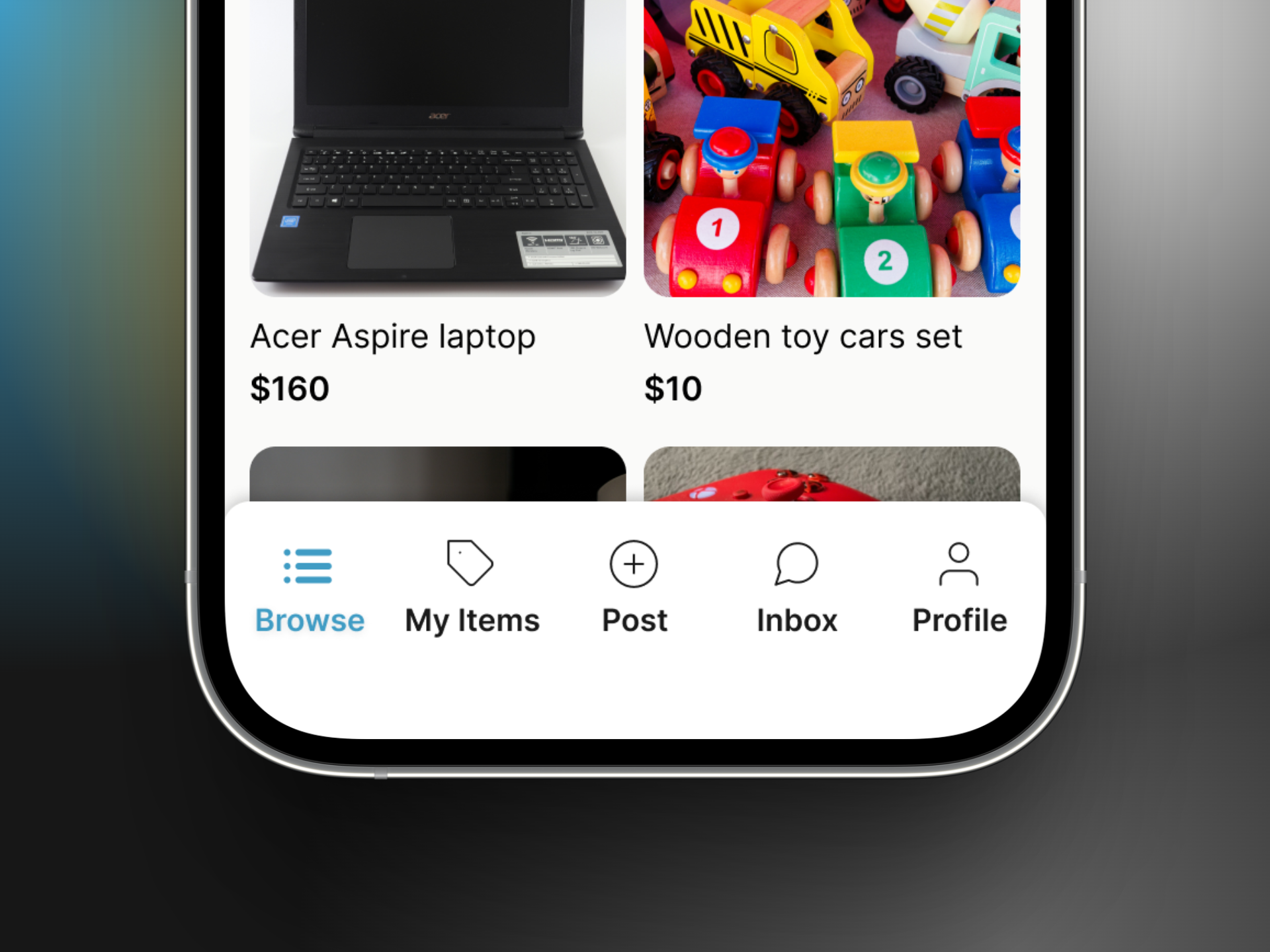
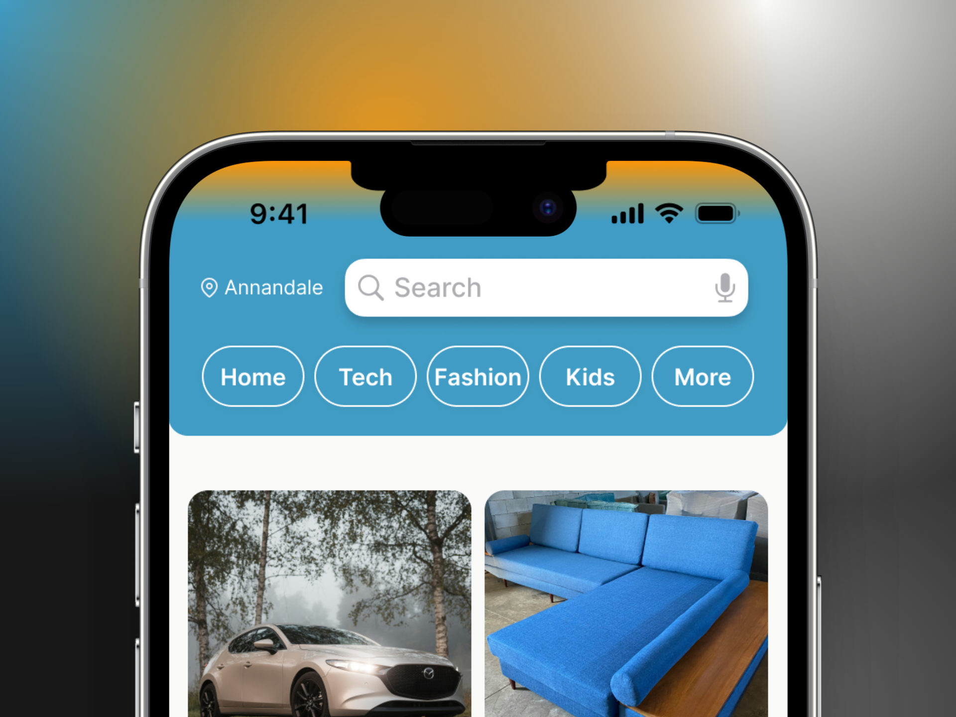
Following HIG meant users would recognize the patterns, like the tab structure, the touch targets, and the type scale, before they understood the brand.

I kept the bottom nav to five tabs and used a More menu for additional category filtering to continue familiarity.
Bottom phone screen view of Givenly's tab bar with options to click on browse, my items, post, inbox, and profile.
Bottom navigation.
A phone showing a close-up of the top of Givenly’s app. It shows the search bar and navigation menu that consists of buttons for home, tech, fashion, kids, and more.
Top navigation.
A smartphone screen displaying a listing for a 2023 Mazda 3 Hatchback for $25,000, with a description of its features and condition, and a bottom button displaying “message seller.”
Ad listing screen.
finding #2
Clutter is overhwhelming.
My competitive analysis of Facebook Marketplace felt overwhelming. OfferUp was calmer and more focused.

I used OfferUp's restraint as my model, where white space was used intentionally, listing screens kept focused on what a buyer actually needs to make a decision.
finding #3
Color and Typography Matter
I've always loved color psychology, so I researched to inform the palette: Teal for calm reliability (essential in a marketplace where trust matters), Orange for approachable energy, and Purple as an accent.

Typography pairs Poppins headings (modern, warm) with Inter body text (designed for digital reading, with letterforms that reduce fatigue).

Every combination was verified against WCAG AA contrast ratios.
A smartphone displaying the Givenly app logo, which features a gradient from orange to blue with the text 'Givenly' and 'Shop now. Care locally.' below it. A purple silhouette of buildings is displayed at the bottom of the phone screen.
Splash screen.
04
Solution
Givenly's design is built around one simple idea: local exchange should feel like asking a neighbor for help, not filling out a form.

Every decision from the tab structure to the color palette to the payment model was made to put human connection ahead of transaction efficiency.
Browse Screen
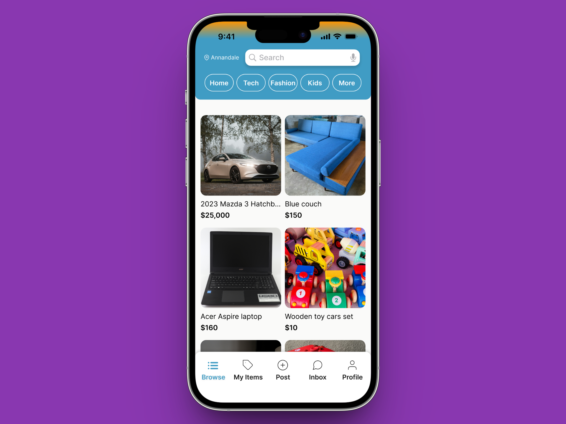
The two-column card grid maximizes content density while keeping tap targets comfortable for one-handed use.

The bottom nav stays to five tabs — Browse, My Items, Post, Inbox, Profile — with a More menu in the top navigation for category filtering.
A smartphone displaying Givenly's online marketplace app with various items for sale, including a car, furniture, a laptop, and toys.
Browse screen.
A smartphone screen displaying a listing for a 2023 Mazda 3 Hatchback for $25,000, with a description of its features and condition, and a bottom button displaying “message seller.”
Ad listing screen.
Listing/Ad Screen
The listing page balances photo-forward presentation with the key details a buyer needs — condition, price, and a clear path to message the seller. Payment is arranged directly between users (cash, Venmo, PayPal), keeping the exchange personal.
Inbox
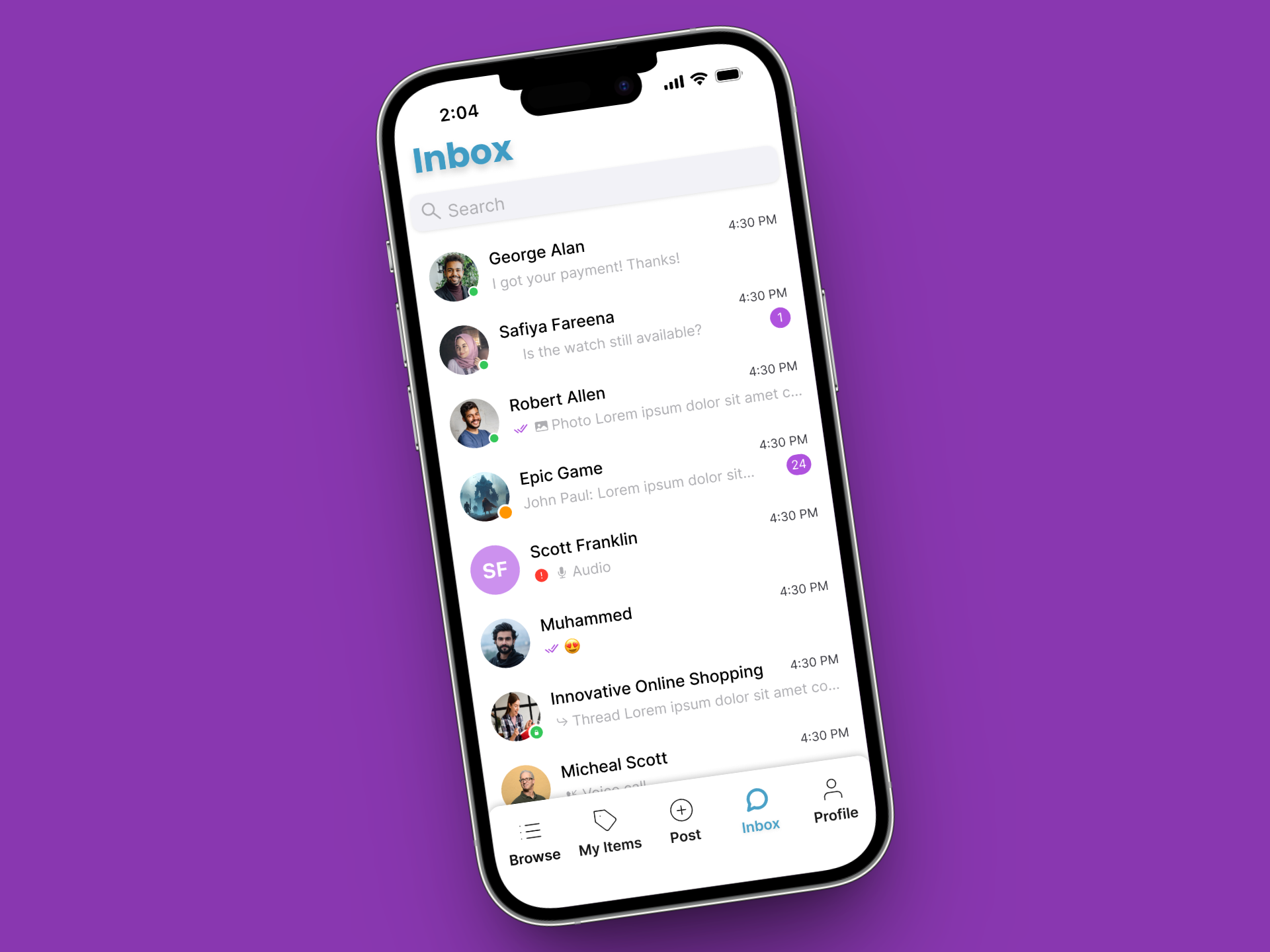
In-app messaging lets buyers and sellers coordinate safely before meeting in person, exactly how Brian, Givenly's user story, went from a listing to a handshake in a parking lot.
A smartphone displaying an inbox with a list of email messages, each showing a sender, subject, and timestamp.
05
Reflection
Givenly reinforced how much research can shape design decisions. Almost every choice, like tab count, type size, and color, was grounded in either HIG recommendations or competitive analysis.

The project deepened my understanding of how platform conventions aren't constraints to design around, but frameworks that make experiences feel familiar and trustworthy the moment someone opens the app.
Next Case Study
To-Do App