UX RESEARCH · UX/UI DESIGN

To-Do App

* In progress*

A mindful to-do app exploring whether emotional support at the moment of task completion can ease stress without disrupting productivity.

role
Solo Designer
Timeline
2 weeks
tools
Figma, Figma Slides
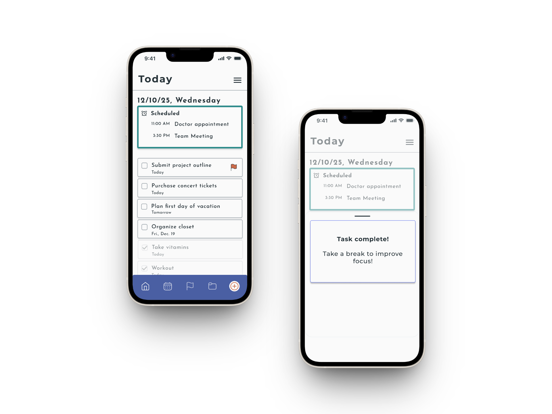
Two phone screens displaying a to-do list app. The left screen shows scheduled appointments and a list of tasks. The right screen shows a completed task notification, reminding the user to take a break.
01
Snapshot
This to-do app was designed for a hypothetical startup client looking to stand out in a crowded productivity space. The core features — adding tasks, marking them complete, flagging critical items — are familiar by design.

The differentiator is what happens the moment you check something off: a Mindful Completion Message surfaces, offering a short, encouraging nudge that acknowledges your progress without turning productivity into performance.

This was a conceptual project completed as part of my UX design program.
5
Users Tested
2
Prototype Iterations
3
Apps Analyzed
02
Problem
Open any to-do app, and you'll find roughly the same thing: a list, a checkbox, maybe some color-coding. They're efficient. They get the job done. But if you're already overwhelmed, staring at a long list of unchecked items can make things worse, not better.

I kept coming back to this question during competitive research: these apps are great at helping people do more. But none of them seem to care whether the person doing the doing is okay.

That's where this project started.

How can a to-do app support the whole person — not just the task list?
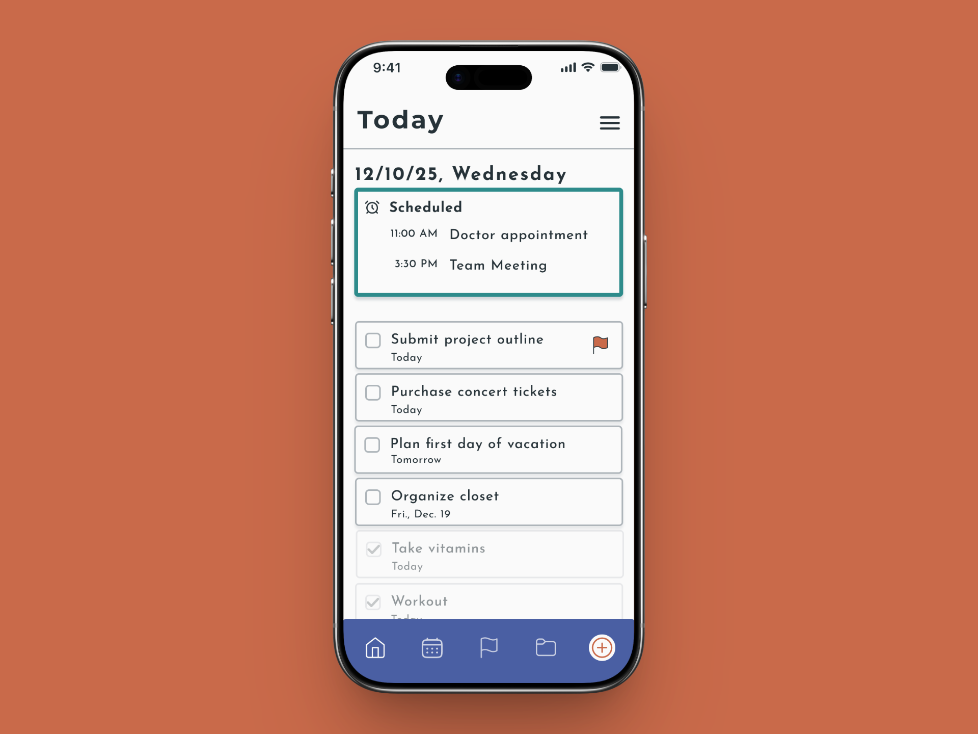
A smartphone displaying a daily schedule with scheduled appointments and a to-do list.
Open any to-do app, and you'll find roughly the same thing: a list, a checkbox, maybe some color-coding. They're efficient. They get the job done. But if you're already overwhelmed, staring at a long list of unchecked items can make things worse, not better.

I kept coming back to this question during competitive research: these apps are great at helping people do more. But none of them seem to care whether the person doing the doing is okay.

That's where this project started.

How can a to-do app support the whole person — not just the task list?
03
Process
I analyzed Todoist, TickTick, and Things3, looking at where they excelled and where they fell short. They're all well-designed. They all reduce cognitive load, support fast task capture, and show progress in ways that feel motivating. What none of them did was acknowledge the emotional experience of using them — especially when you're stressed, behind, or running on empty.

I used the WSJF framework to prioritize potential differentiating features and landed on Mindful Completion Messages: short prompts that appear after you check something off, offering a gentle nudge — something like "Take a deep breath" or "Mindful tip: taking breaks increases focus." Not a celebration. Not a streak. Just a small moment of acknowledgment.

I sketched lo-fi wireframes by hand, moved into a hi-fi prototype in Figma, and then tested it with five participants ranging from 25 to 54, with mixed levels of tech experience. Three sessions were in person, two were remote. I used a think-aloud protocol and asked people to walk through core tasks while narrating what they were noticing.

The core functionality rated 9.3 out of 10 for ease of use. That part was working.

The completion messages were a different story.

Three of five users found them neutral or distracting. One found them genuinely meaningful and grounding. One wanted the option to turn them off entirely.

The data was telling me something specific: this feature resonates with a particular kind of user — someone who's already wellness-oriented and open to that kind of nudge. For task-focused users, it landed as an interruption, not a support.

That tension became the most important finding of the project. It wasn't that the feature failed. It was that it was designed for everyone, when it needed to be designed for someone — with an option to customize or turn it off entirely.

The second iteration addressed what testing surfaced: I replaced a confusing checkmark icon with a home icon, updated the color palette to something with more contrast and broader appeal, extended the message display time so people could actually read them, removed emojis for a cleaner look, and added drop shadows to improve visual hierarchy.

My instructor's feedback on the second iteration was honest: the changes leaned more aesthetic than problem-focused. He was right.

I can't recall what state of mind I was in and why I didn't pursue the solution to make the messages optional, but that feedback stuck with me, and it's something I've thought about on every project since.
User persona for Dana Holloway, age 46, a dental hygienist and homeowner from Burke, VA. The persona outlines her needs (visualizing furniture in her space, building trust through reviews and specs), goals (finding stylish, durable furniture that fits her budget and values), pain points (difficulty picturing scale and material from photos, too many options with too little detail), and behaviors (browsing on mobile first, switching to laptop to finalize purchases, reading reviews carefully before committing
finding #1
Ease of use highly rated.
Core task management earned a 9.3 out of 10 for ease of use.

The clean layout and visual hierarchy kept users focused, which confirmed the foundation was solid.
"Everything seems logical, action buttons on the bottom, menu is clear. Layout is good."

- Benton, Research participant
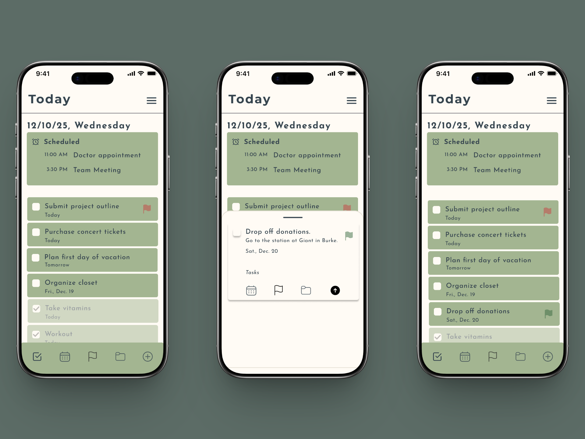
Three iPhone screens displaying a daily planner app with scheduled events and to-do lists.
Navigating from home, adding a task, and showing the task as added to the list.
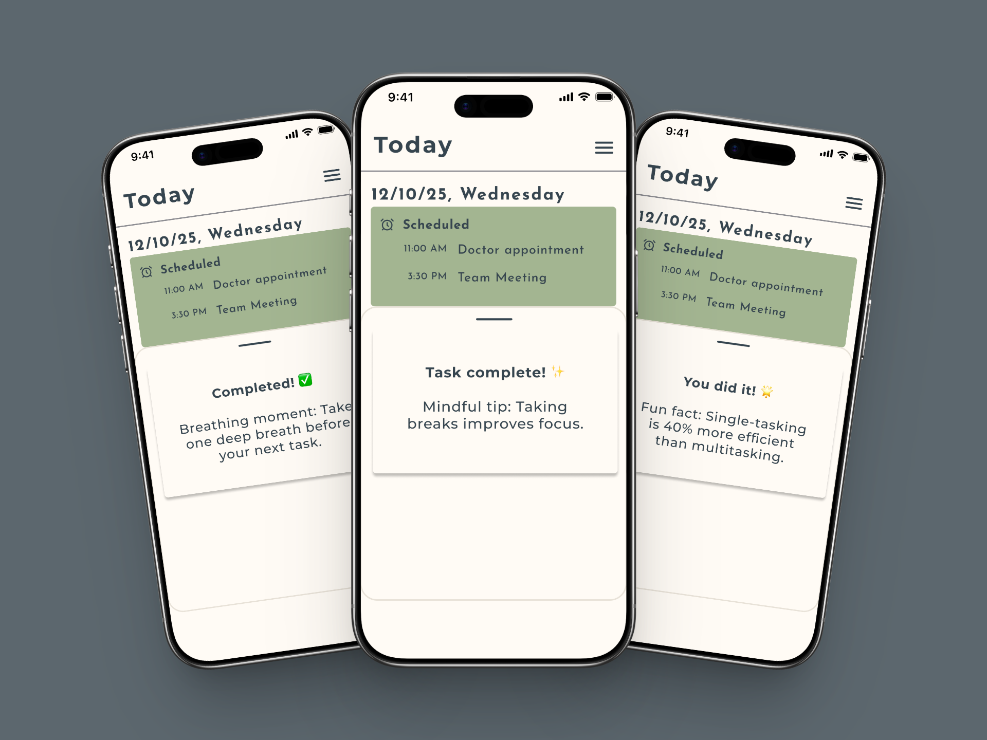
Three phone screens showing a daily schedule app with uplifting completion messages like "Completed! Breathing moment: Take one deep breath before your next task."
completion message screens as mockups
finding #2
Mindful Completion Messages resonated with some users, but not all.
Three of five users found them neutral or distracting. One found them genuinely meaningful. The feature didn't need to be cut. It needed to be optional.
"Sometimes we get wrapped up in doing everything all the time, and they're just little nuggets of a reminder to just chill for a second."

— Lindsey, Research Participant
finding #3
Navigation and visual design created friction.
Unlabeled icons confused users. The color palette didn't land for everyone. Messages disappeared before users could read them. These were the specific, fixable problems the second iteration addressed.
"I wasn't sure whether to click the check-mark or plus sign from the bottom nav."

- Ranette, Research participant
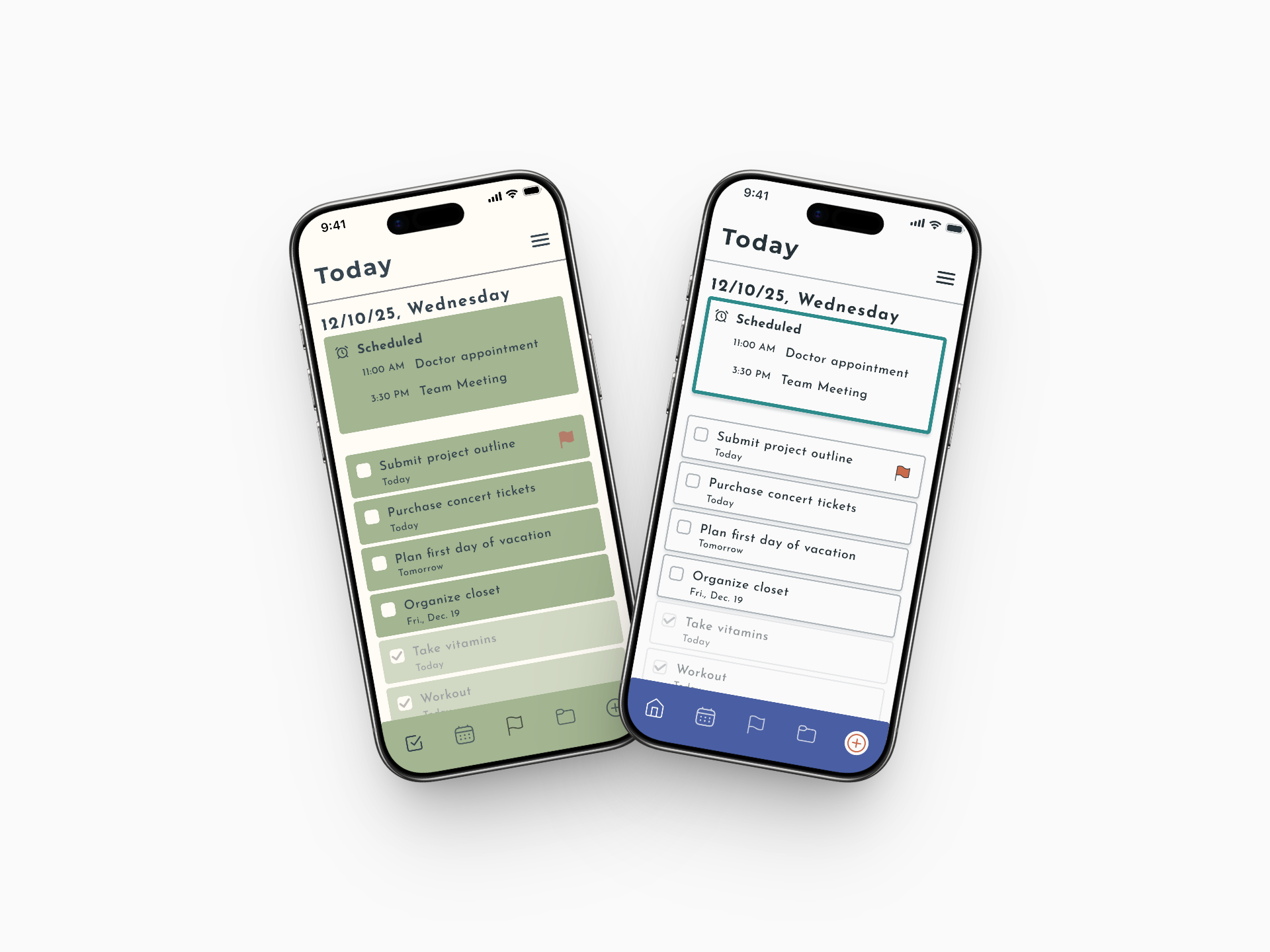
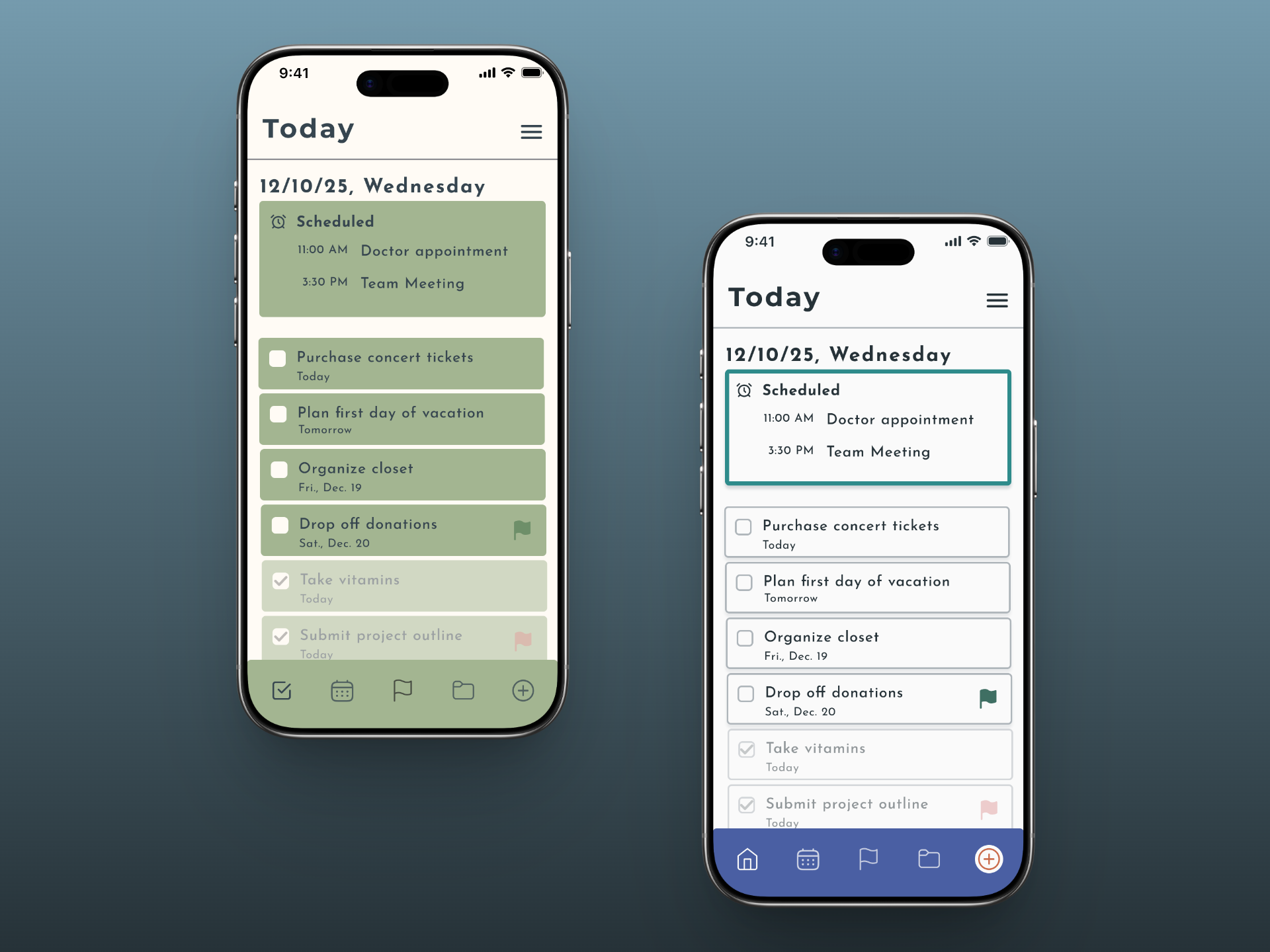
Two smartphones displaying a to-do list app. The left one is version one in green and a check icon in the navigation bar. The right phone is version two in blue with a home icon instead of a check icon.
Before and after comparison.
04
Solution
The second iteration of the app was built around what testing told me: make the core flow cleaner, make navigation clearer, and give users more control over the emotional layer.
Navigation
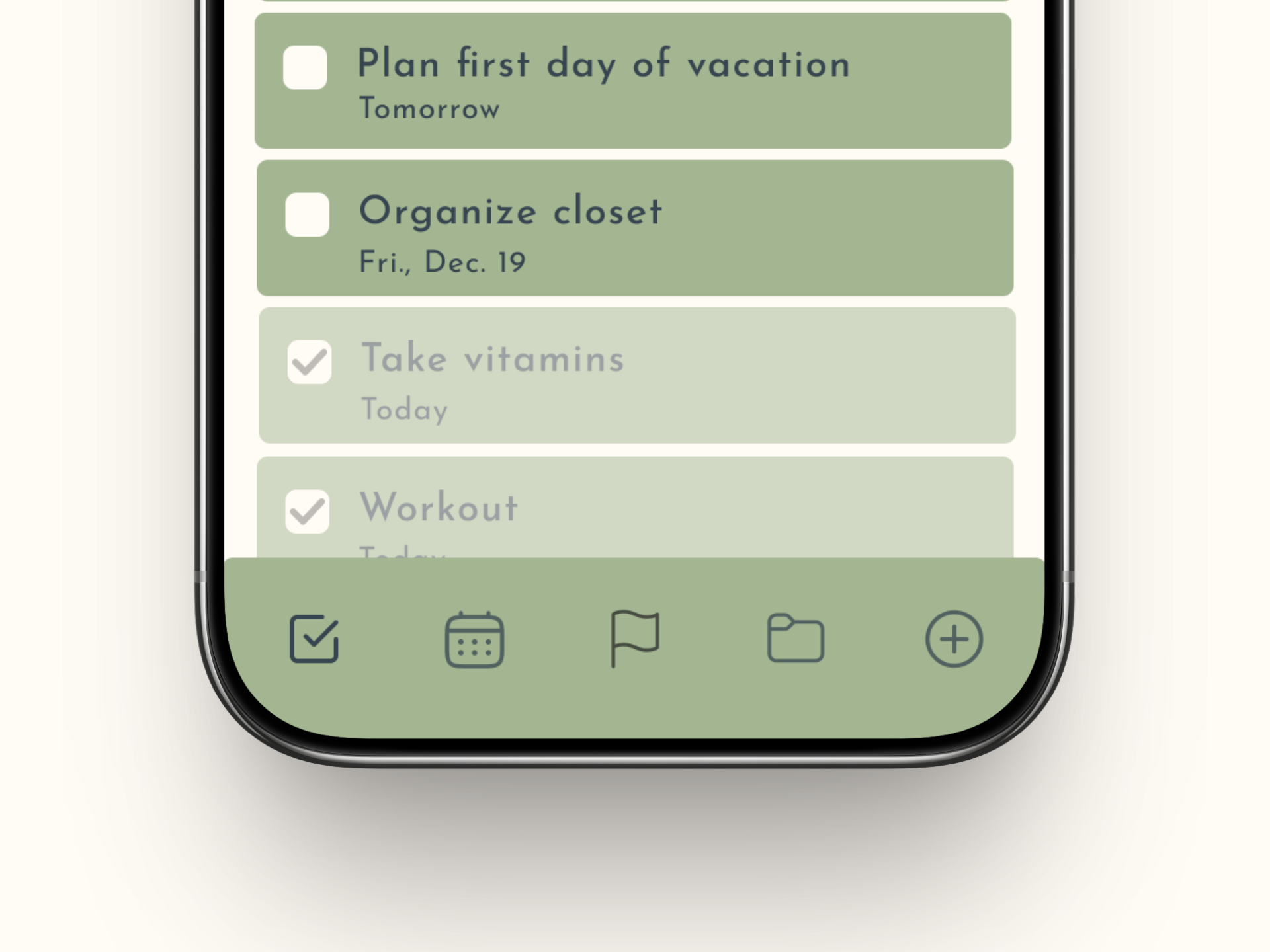
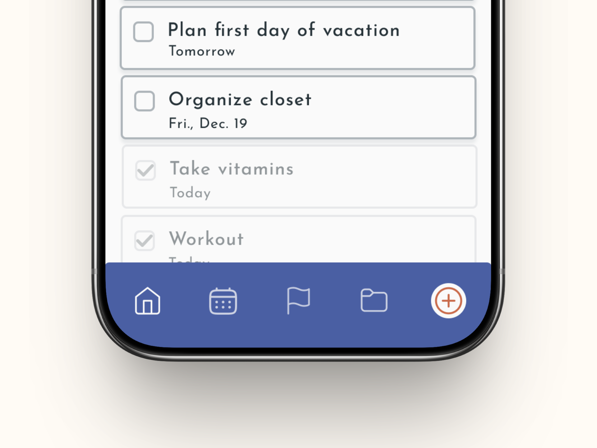
The confusing checkmark icon was replaced with a more universally recognized home icon, removing the ambiguity between it and the add-task button.
A to-do list on a smartphone screen with a close-up view of the bottom navigation bar. It shows a checkbox, calendar, flag, file folder, and plus sign. icons.
Navigation bar before - First iteration
A to-do list on a smartphone screen with a close-up view of the bottom navigation bar. It shows a home, calendar, flag, file folder, and plus sign icons.
Navigation bar after - Second iteration
A before-and-after of two phone screens showing a to-do list app.
Before and after home screens.
Visual Design
The color palette was updated to something brighter and more diverse. Drop shadows were added to distinguish task and schedule boxes. The modal background was dimmed to bring focus to the overlay. Emojis were removed for a cleaner, more professional feel.
Completion Messages
Message display time was extended so users can actually read them. Word count was reduced to make them easier to absorb. A stroke was added around the message boxes for visual polish.
A before-and-after of two phone screens displaying a to-do list with scheduled appointments and a reminder to take a breath.
05
Reflection
This project gave me real experience running moderated usability tests and sitting with results that challenged my initial assumptions.

The Mindful Completion Messages taught me something I'll carry into every project: a feature that resonates deeply with one user segment can feel like noise to another — and that's not a failure, it's a signal pointing toward personalization and user control.

My instructor's note that my changes leaned more aesthetic than problem-focused was fair — and honest. Earlier in the program, I was still learning both Figma and the UX process simultaneously. Looking back, I would spend more time asking what problem the visual changes were solving before making them.